Corner Grocery Brand Identity Board
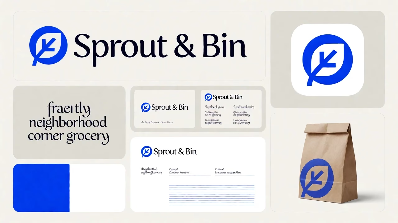
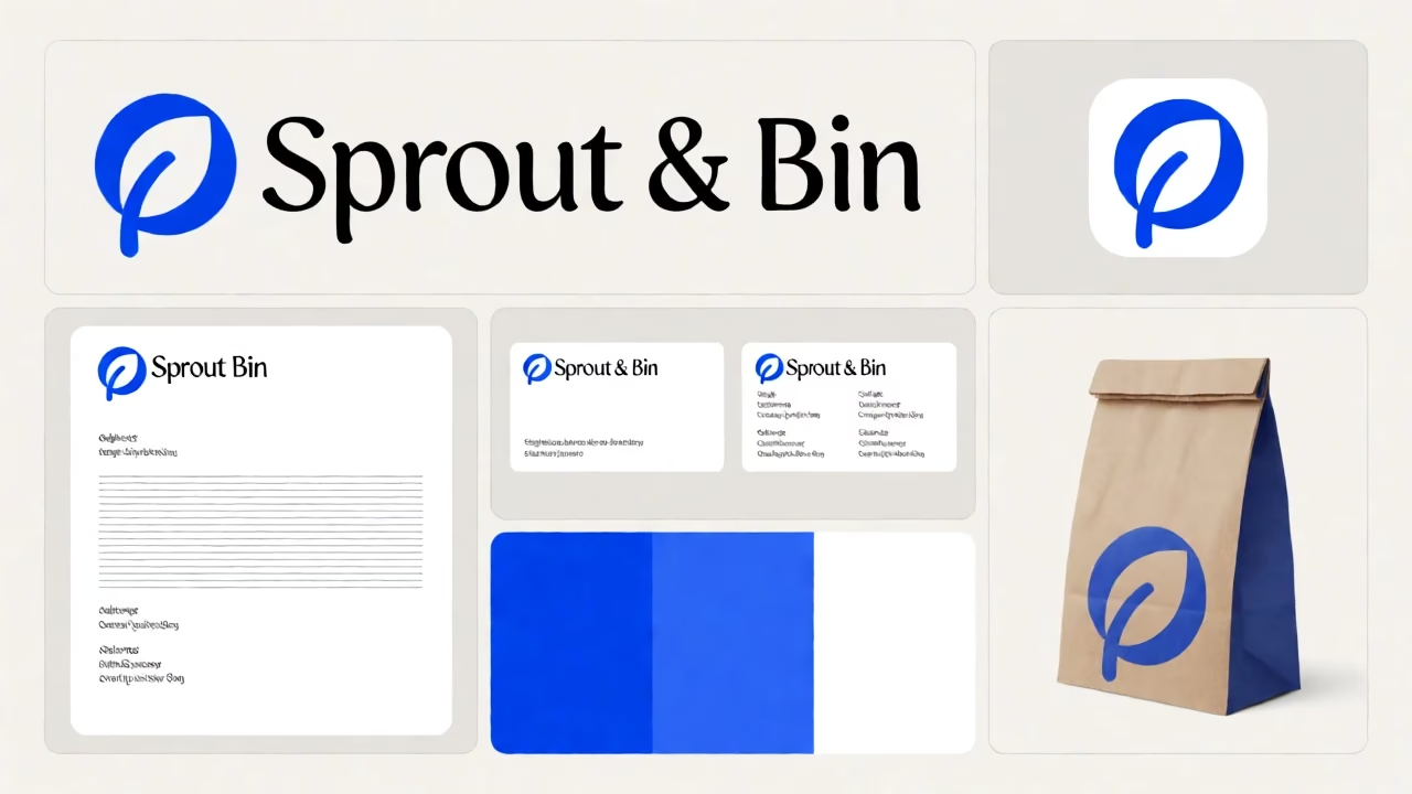
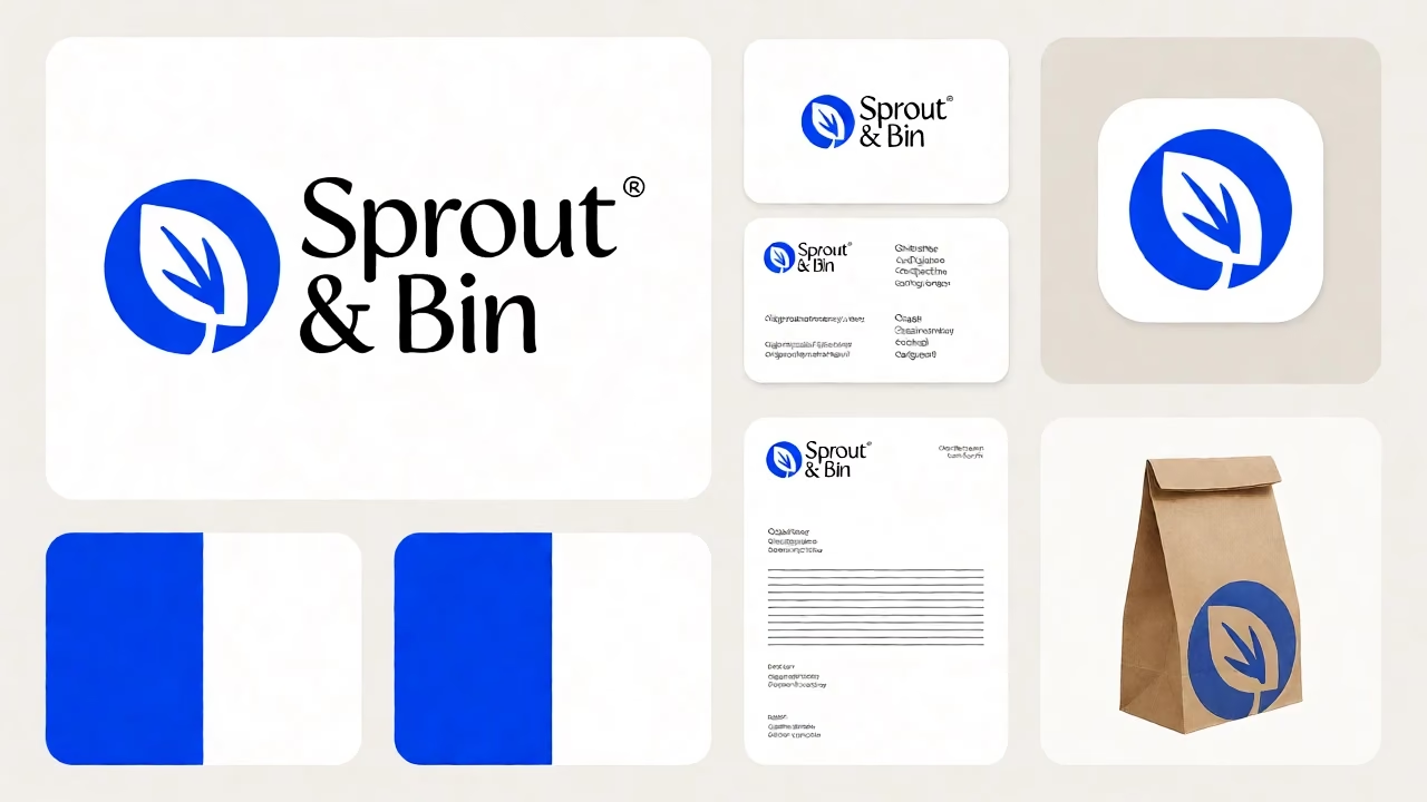
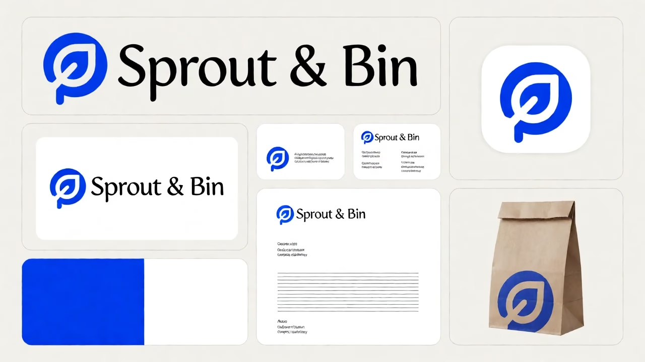
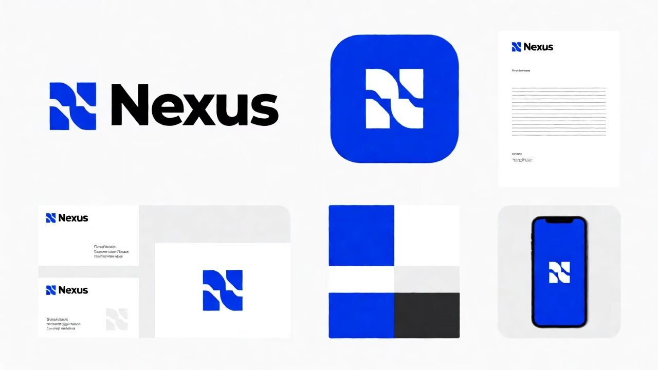
A grid layout brand identity board for a corner grocery featuring logos, cards, and swatches in electric blue and white.
Prompt
· English
A brand identity board on one canvas laid out in a neat grid with even margins on a calm background, displaying a cohesive visual system for a neighbourhood corner grocery. The top left panel features the large primary logo for "Sprout & Bin," a rounded geometric icon of a leaf inside a circle next to the brand name in a humanist sans-serif typeface with distinct calligraphic strokes. To the right, the app icon is shown as a square tile with rounded corners, using the same leaf symbol in electric blue on a white field. The center row displays a business card front and back; the front holds the logo and a short placeholder line of text, while the back shows a grid of contact information placeholders in the same typeface. Below the cards, a letterhead layout presents the logo in the top corner with horizontal placeholder lines for address and contact details. The bottom left panel contains colour swatches, showing solid blocks of electric blue and pure white. The bottom right panel holds one product mockup, a paper bag with the logo printed on the side. The entire board maintains a playful friendly personality with rounded shapes applied to every graphic element and text container. The typography throughout is a humanist sans-serif with calligraphic strokes, ensuring readability and approachability. The background is a flat, neutral off-white surface that allows the electric blue and white brand colours to stand out clearly. The layout is precise, with consistent spacing between each element, creating a professional presentation suitable for a client review. Rendered as a flat vector graphic design with sharp edges, solid colour fills, and clean lines.